
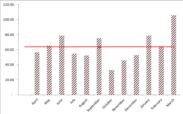
Open M S Excel > Create the Data

Select the Data Range > A3:B14 > Press Alt + F1 to Create Bar Chart > go to Layout >Patterns
Change the Chart color and design as per your requirement.
Remove Lines in Chart

Right click Chart > Select > Add > Enter > Serial name and Value


Right click the new bar chart > Change Chart Type to X, Y Scatter Chart

Click the X y Scatter Chart > Select Data > Select Average > Edit > Put Series Y Value 6

Again select x y Scatter Chart > go to Layout > in Analysis Group Select Error Bar.
Click Error Bar with Percentage
Change the Marker option > Click in Build > Select Marker type as Line.
Set the Error Bar Percentage 100
Change the Average line color and width


Select the Data Range > A3:B14 > Press Alt + F1 to Create Bar Chart > go to Layout >Patterns
Change the Chart color and design as per your requirement.
Remove Lines in Chart

Right click Chart > Select > Add > Enter > Serial name and Value


Right click the new bar chart > Change Chart Type to X, Y Scatter Chart

Click the X y Scatter Chart > Select Data > Select Average > Edit > Put Series Y Value 6

Click Error Bar with Percentage
Change the Marker option > Click in Build > Select Marker type as Line.
Set the Error Bar Percentage 100
Change the Average line color and width

Any Further Quires please
feel Free to Contact us:
goodwilllearningworld@gmail.com
goodwilllearningworld@outlook.com
Download the Excel File
No comments:
Post a Comment